31 - form : tamaño de los controles de formulario
Bootstrap 5 nos permite definir 3 tamaños de controles de formulario. Tenemos el tamaño por defecto, un tamaño grande y un tamaño pequeño.
Las clases que nos permiten definir los tamaños de los controles:
form-control-lg
form-control-sm
Veamos un formulario que utiliza los tres tamaños disponibles:
<!doctype html>
<html>
<head>
  <title>Prueba de Bootstrap 5</title>
  <meta charset="utf-8">
  <meta name="viewport" content="width=device-width, initial-scale=1, shrink-to-fit=no">
  <link href="https://cdn.jsdelivr.net/npm/bootstrap@5.0.0/dist/css/bootstrap.min.css" rel="stylesheet" integrity="sha384-wEmeIV1mKuiNpC+IOBjI7aAzPcEZeedi5yW5f2yOq55WWLwNGmvvx4Um1vskeMj0" crossorigin="anonymous">
</head>
<body>

  <div class="container">
    <p><strong>Tamaño pequeño</strong></p>
    <form>
      <div class="mb-3">
        <label for="nombre2" class="form-label">Ingrese su nombre:</label>
        <input type="text" class="form-control form-control-sm" id="nombre2" name="nombre2">
      </div>
      <div class="mb-3">
        <label for="clave2" class="form-label">Ingrese su clave:</label>
        <input type="password" class="form-control form-control-sm" id="clave2" name="clave2">
      </div>
      <button type="submit" class="btn btn-primary">Enviar</button>
    </form>

    <p><strong>Tamaño grande</strong></p>
    <form>
      <div class="mb-3">
        <label for="nombre3" class="form-label">Ingrese su nombre:</label>
        <input type="text" class="form-control form-control-lg" id="nombre3" name="nombre3">
      </div>
      <div class="mb-3">
        <label for="clave3" class="form-label">Ingrese su clave:</label>
        <input type="password" class="form-control form-control-lg" id="clave3" name="clave3">
      </div>
      <button type="submit" class="btn btn-primary">Enviar</button>
    </form>

    <p><strong>Tamaño normal</strong></p>
    <form>
      <div class="mb-3">
        <label for="nombre" class="form-label">Ingrese su nombre:</label>
        <input type="text" class="form-control" id="nombre" name="nombre">
      </div>
      <div class="mb-3">
        <label for="clave" class="form-label">Ingrese su clave:</label>
        <input type="password" class="form-control" id="clave" name="clave">
      </div>
      <button type="submit" class="btn btn-primary">Enviar</button>
    </form>

  </div>

</body>
</html>
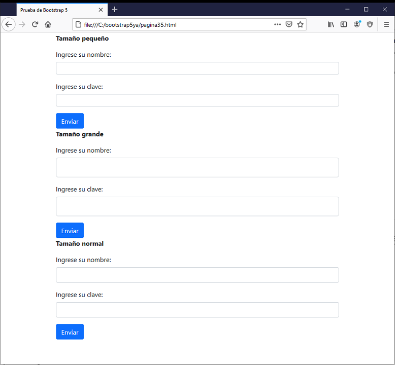
Los tres formularios con controles de distinto tamaño tienen una apariencia en el navegador similar a:
Si queremos que el control de formulario aparezca con un tamaño pequeño agregamos la clase "form-control-sm":
<input type="text" class="form-control form-control-sm" id="nombre2" name="nombre2">